Peloton Training Programs
Peloton is a connected fitness company known for its interactive workout hardware and subscription-based content. While best known for the Bike and live/on-demand classes, the company has expanded its product line to include a treadmill, rower, and a connected TV device called Guide.
This case study focuses on redesigning the Training Programs experience to better support a growing set of workout modalities—especially for new platforms like Guide.
Role
Lead Product Designer
Responsibilities
End-to-end UX + UI, content strategy, prototyping, internationalization
Collaborators
Product, Content, Research, Engineering, QA, Program & Project Management
Timeline
Q3 2020–Q2 2021

🧠 Problem
Peloton Training Programs are structured collections of fitness classes designed to help members achieve specific goals—like building core strength or improving endurance. However, the legacy experience was unstructured and difficult to follow. Members lost track of their progress, got discouraged, and often dropped out after the first week.
This was one of the most requested areas for improvement from the member community—and a major opportunity to drive retention and deepen engagement across devices.
🎯 Goals
We set out to redesign the Training Programs experience to:
Give members a clearer sense of structure and accomplishment
Make it easier to track weekly and overall progress
Support new modalities and devices, including Peloton Guide
Increase program completion and repeat participation
Build a flexible system that scales across disciplines and markets
🛠️ My Role
Led end-to-end product design for Training Programs 2.0 across Bike, iOS, Android, Web, TV and Guide
Owned UX and UI from early research through launch
Defined content strategy and onboarding flows
Created prototypes for testing and stakeholder alignment
Collaborated with Product, Engineering, Content, Research, and QA
Ensured internationalization across global markets
📋 Key Features
Prescribed Schedule – Weekly breakdowns with recommended class cadence, helping members stay accountable and build habits.
Progress Tracking + Badges – Clear visibility into completed classes and unlockable achievement tiers (Bronze, Silver, Gold) based on participation.
Program Overview – Preview of all upcoming workouts before starting, including equipment needs and structure.
Mobile, Bike + Guide Compatibility – Designed a responsive system to work across hardware, including Peloton’s newest connected strength product, Guide.
Flexible Completion Rules – Guardrails like class order, optional workouts, and credit logic—all designed to balance flexibility with structure.
📈 Outcomes
9.6% of monthly active members started a Training Program after launch (Peloton Homecoming, May 1, 2021)
2.1M+ workouts completed via Programs 2.0 in the first 30 days (vs. 2.3M for Programs 1.0 over the prior two months)
454.6K members started a Training Program within six weeks of launch
52.2% of members who started in week one returned for week two
Rolled out platform-wide across Bike, Tread, Guide, iOS, Android, and TV (Apple TV, Roku, Fire TV)
Established a scalable, cross-platform foundation for future programming innovation
Existing Experience
Below is a screen recording of the legacy experience - it lacked structure, making it difficult for members to track progress or feel motivated to complete a program. Engagement often dropped after week one.
Takeaways
Lack of schedule/structure
No progress tracking
Confusing entry points and flows
Getting to Training Programs 2.0
We kicked off with an off‑site workshop to align cross-functional leaders on Training Programs 2.0. Participants from Product, Design, Research, Content, Engineering, and Program Management collaborated to define goals, constraints, and a unified vision for the experience.
After grounding ourselves in user pain points and platform requirements, we explored, sketched, and ideated rapidly—surfacing early hypotheses and design directions aligned with broader business and member goals.
By day’s end, we converged on three core pillars: Structure, Understanding, and Achievement. These themes guided our early feature vision—clear program boundaries, prescribed schedules, progress visibility, upfront expectations, and celebratory completion rewards.

A few artifacts from our offsite workshop, where we explored what a modern training program should be. We used card sorting to define key concepts, then sketched, shared, and critiqued ideas to align on core functionality within the Peloton ecosystem.
Key Design Themes
Grounded in the pillars of Structure, Understanding, and Achievement, these features formed the foundation of the redesigned Training Programs experience:
Upfront Program Details – Time commitment, class count, and equipment needs are shown before joining—reducing friction and surprise drop-offs.
Clear Start & End Points – Members commit to a program with a visible duration and end date—establishing a sense of purpose and momentum.
Prescribed Scheduling – Structured weekly plans guide members to take specific classes on specific days—supporting healthy pacing and habit formation.
Weekly + Overall Progress – Progress trackers show how members are performing week-by-week and across the full program—reinforcing consistency.
Completion Badges – Members earn achievement badges based on participation—adding a sense of celebration and incentive to follow through.
We explored multiple approaches to pacing, accountability, and flexibility—testing concepts with members and refining based on feedback.


Iterating on Program Details: early versions were too abstract or too dense; later versions simplified and clarified weekly expectations and added upfront detail.


We explored multiple ways to help members stay on track week-to-week. The final design gave visibility into each week’s structure while reinforcing motivation with class counts and milestone badges.
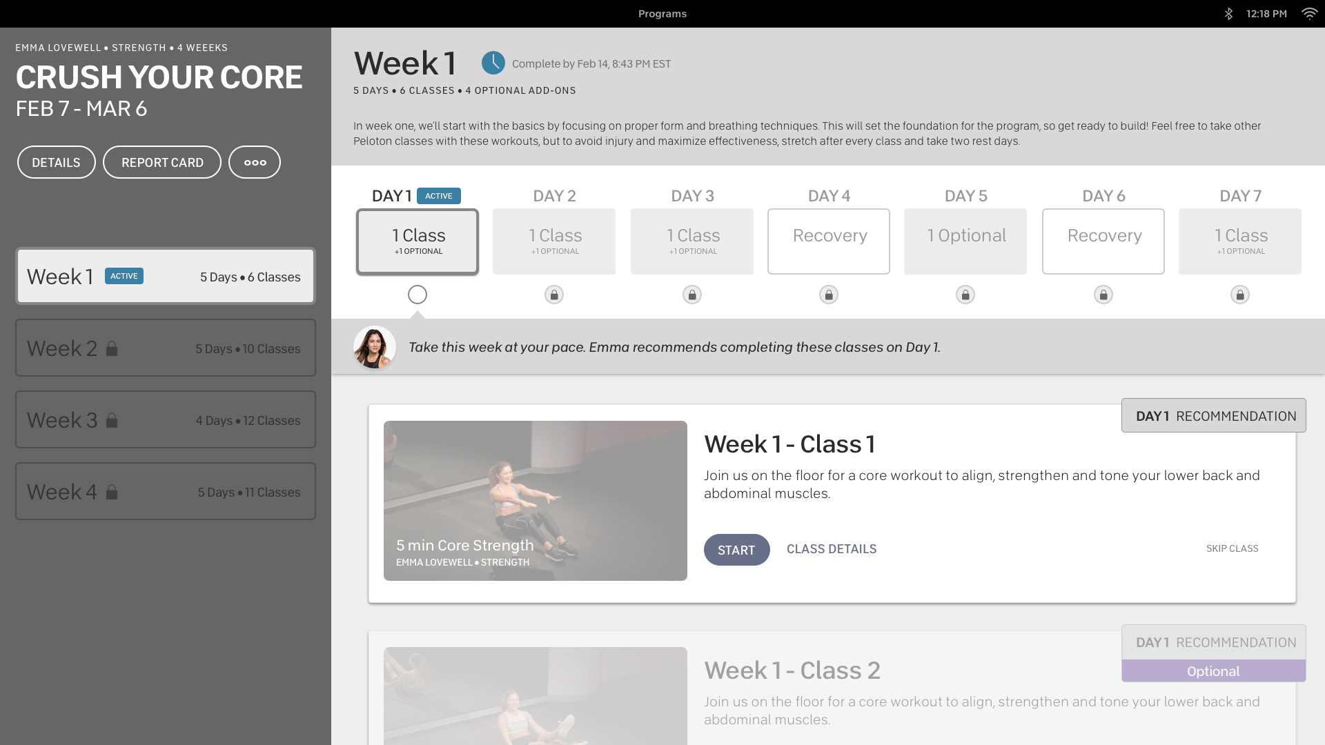
Final UX/UI + Key Design Wins
The redesigned experience introduced structured schedules, clear progress tracking, and achievement badges—resulting in a measurable lift in engagement and completion.
Lessons Learned
Training Programs 2.0 was a complex cross-platform initiative that required balancing structure with flexibility. It gave us the opportunity to reimagine one of Peloton’s most valuable member experiences. By anchoring the design in structure, progress, and reward, we delivered a system that motivated members to commit and follow through—ultimately exceeding our engagement goals.
What worked:
Tight alignment between content, design, and product teams
Weekly structure and badge incentives increased motivation
Upfront time commitment helped reduce early drop-off
What didn’t:
Some members wanted more flexibility than the prescribed schedule and program structure allowed
Auto-advancing weeks and locking programs after their end date frustrated members who preferred to move at their own pace—even without earning a badge
Program linearity worked well for many, but wasn’t ideal for all modalities (e.g., strength vs. yoga)
How we responded:
Post-launch feedback surfaced a desire for more control and personalization. We introduced UI affordances to revisit past sessions, skip ahead, or restart specific weeks—improving usability without compromising the motivational framework.
This work deepened our understanding of how structure, behavior, and motivation intersect in long-form fitness content—and laid the foundation for future iterations of Peloton’s programming model.